What to Expect During the Design Phase
The design phase does not start with a logo. It starts with stylescapes. Understanding this distinction, and what comes after it, is the difference between a client who navigates this phase well and one who arrives at the end of it unsure how they got there.
It Starts With Stylescapes, Not a Logo
This surprises almost every client.
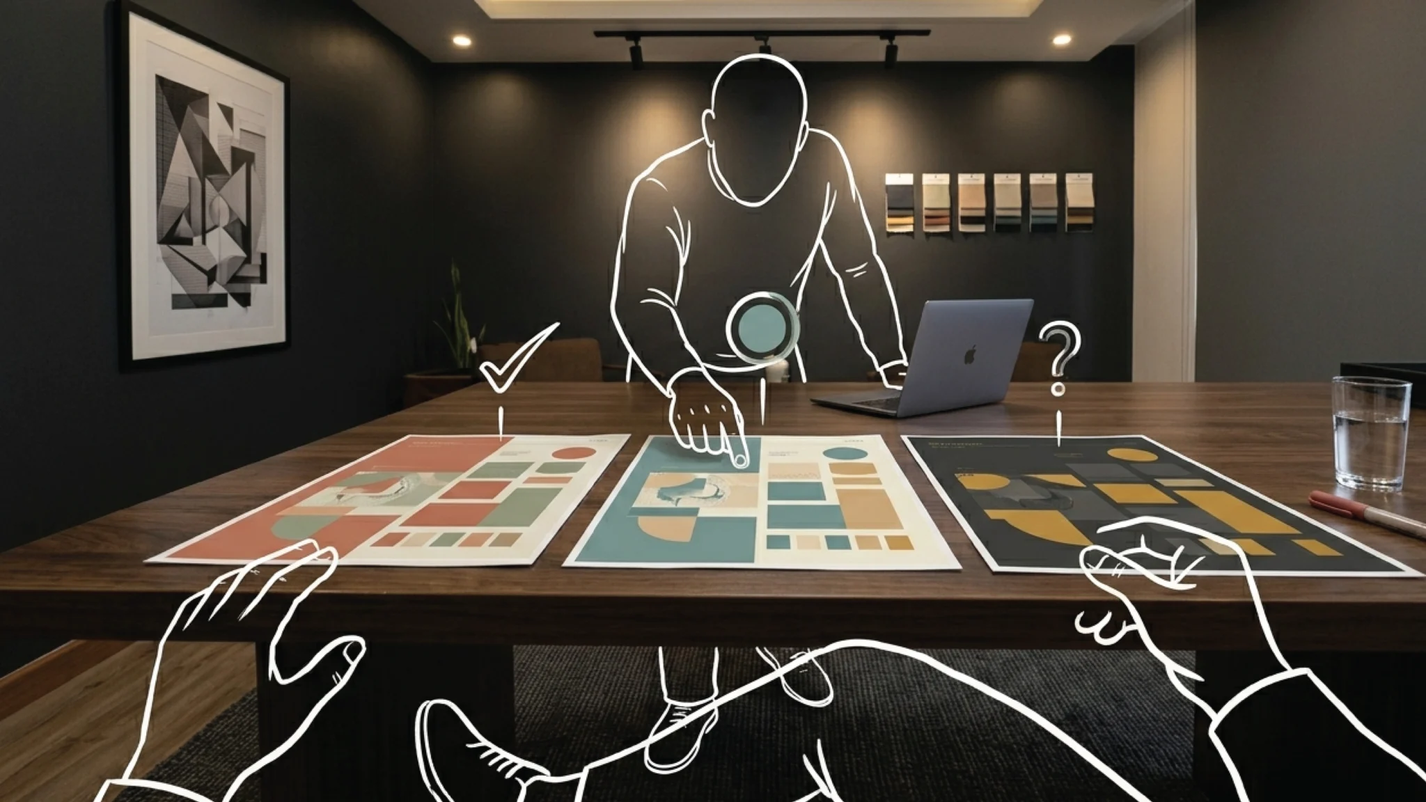
When the design phase begins, the first thing you receive is not a logo concept. It is a stylescape: a visual direction board that communicates the overall look and feel of the brand before a single logo has been drawn. Colour palettes. Typography samples. Imagery style. Texture and tone. The overall emotional register the brand is being built toward.
A stylescape is not a draft of your brand. It is a direction indicator. Its job is to align us on the visual language before any logo work begins, so that when we do move into logo design, we are both working from the same picture.
Depending on your scope, you will receive one to three stylescapes. Before any conversation happens, we record a screen walkthrough of each direction. You receive a link to that recording via WhatsApp. Watch it fully, share it with anyone on your team who needs to weigh in, and sit with it before you respond.
The feedback you give after the stylescape video is one of the most important inputs in the entire project. It steers everything that follows. Take time with it, come to your response with specifics, and when you are ready we schedule a call to align on the direction. Vague stylescape feedback produces vague logo design. Clear direction at this stage compresses the rest of the design phase significantly.
Logo Design: What You Will See and How to Read It
Once a stylescape direction is agreed, logo design begins.
You will receive one to three logo concepts depending on your project scope. As with the stylescapes, every presentation starts with a recorded walkthrough, not a live reveal. Ben records a screen walkthrough of each concept, showing the mark applied to real-world contexts: a business card, a website header, a dark background, a light background, at small scale and at large scale. A logo that looks strong on a white artboard can fail in real-world applications. The walkthrough shows you where the brand will actually live, not just what it looks like in isolation.
Each concept in the recording comes with verbal rationale. Not “this looks good” but “this communicates authority and approachability because of the weight of the mark and the warmth of the secondary typeface, which reflects the positioning we agreed on in strategy sessions.” Watch the rationale section of the walkthrough before you form your opinion on the visual. Then look at the design. Then look at it in the context mockups.
That sequence produces far more useful reactions than looking at a mark on a static slide and responding from instinct alone. Design that is grounded in strategy does not always look like what you expected. That is often a good sign. It means the work is responding to the brief rather than to what was familiar before. [Understanding the Design Rationale: Why We Made Those Choices] covers how to evaluate design against strategy rather than personal preference.
Revision Rounds: Refining, Not Restarting
After you select a concept, or indicate a hybrid direction that combines elements of more than one, revision rounds begin.
Each revision is delivered the same way: a recorded walkthrough showing the updated work, sent via WhatsApp before any call. You review it, gather internal feedback, process your response, and then we connect to align. Nothing arrives on a live call without you having seen it first.
Revisions are refinements of the chosen direction. They work within the agreed strategic and visual framework. Adjusting the weight of a typographic element. Testing a slightly warmer shade of the primary colour. Refining the proportions or spacing of the mark. Exploring an alternative lockup of the same concept.
A request that requires starting from scratch is a different thing entirely. Introducing a completely new concept, shifting the strategic direction, or adding brief elements not agreed during the strategy phase are new directions, not revisions. We will always tell you clearly which category a request falls into before we proceed, and if additional scope is required we raise it in writing before beginning.
The number of revision rounds included in your project is defined in your proposal and confirmed in your contract. Check it if you are unsure. Your project contact on WhatsApp can clarify. [How Many Revisions Do You Get?] explains the policy in detail and how to use each round well.
Submit consolidated, specific feedback. One round of thorough notes from everyone who needs input is worth more than three rounds of scattered impressions. Gather internal feedback first. Align on a direction. Then send. We cannot act on conflicting messages arriving at different times from different people in the organisation.
Colour System and Typography
Once a logo concept is selected, the broader visual system is built out in parallel with any remaining logo refinements.
The colour system is finalised with exact specifications across three formats: HEX values for digital use, RGB for screen applications, and CMYK for print production. Every colour in the system is delivered across all three formats so the brand looks consistent whether it appears on a website, a proposal cover, or a printed business card. These are not decorative choices. They are technical specifications that govern how the brand reproduces across every surface it touches.
Typography is finalised with specific usage rules: which typeface for headings, which for body text, which weights for which contexts, and how the typefaces are used in combination. Typography is one of the most underestimated brand elements. It signals category, credibility, and personality before a word is consciously read. The wrong typeface in the right colour is still the wrong typeface.
Neither the colour system nor the typography is an afterthought. They are core brand assets that will govern how every future design asset looks, whether produced by our team, by a freelance designer, or by a team member using a template.
Your Role During This Phase
Watch every walkthrough video fully before responding. Not at half-speed in the background while doing something else. The rationale in the recording is part of the presentation. Missing it means giving feedback without the context that makes it useful.
Respond to feedback requests within the agreed window, typically three business days. When responses come in on time, the project moves on schedule. When they slip, the timeline extends accordingly. The pace of the design phase is largely in your hands.
If you have multiple internal stakeholders who need to weigh in, share the walkthrough link with them and gather their input before submitting your consolidated response. Not after. We cannot move forward on a design decision while internal consensus is still being formed. [How to Give Feedback That Actually Moves the Project Forward] has the full guidance on how to structure feedback so each round counts.
When something does not feel right and you cannot name why, do not force vague written feedback. Send a WhatsApp message and ask for a short call. Fifteen minutes of honest conversation is almost always faster and more useful than a long written exchange interpreted from a distance.
Questions about where you are in the design phase? Your project contact is on WhatsApp.
Related Articles
- How to Give Feedback That Actually Moves the Project Forward
- How Many Revisions Do You Get?
- What Happens If the Design Doesn’t Land?