What a Stylescape Actually Is
A stylescape is a visual mood board assembled to communicate design direction. It shows what a brand will feel like before anyone draws a single logo mark.
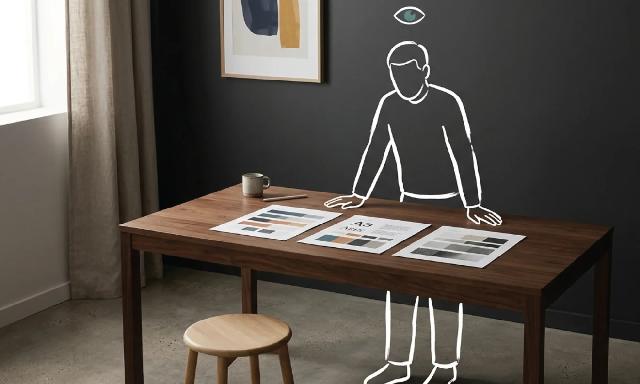
Each stylescape is presented on one slide, with a brief written explanation of the strategic reasoning behind the direction choices. That explanation is what separates a stylescape from a generic Pinterest board. Every element in it is deliberate, not assembled for aesthetic appeal but selected because it communicates something specific about where the brand needs to go.
Within that slide, each stylescape brings together a specific set of elements: a colour palette of three to five tones, two or three typography combinations shown in actual use rather than just font names, a sample of imagery style whether that is photography treatment, illustration approach, or texture, and an overall mood that synthesises all of these into a coherent direction.
The purpose is precise. A stylescape creates a shared language between strategy and design, and between our team and the client. It turns vague words like “professional but approachable” or “premium but not flashy” into something concrete that can be seen, reacted to, and agreed on. It is the bridge between what the strategy says the brand needs to communicate and what the design will actually look like.
A stylescape is not a logo concept. It is the agreed brief that makes the logo concept possible.
Why the Process Starts Here
Logo design is resource-intensive. A fully developed logo concept takes significant time to produce well: the thinking, the sketching, the refinement, the contextual application across different surfaces. Presenting that work to a client who never explicitly agreed on a visual direction is a significant gamble.
The designer has translated words into a visual language that existed entirely in their own head. The client arrives at the presentation having imagined something different. The direction is wrong. The work starts again.
A stylescape surfaces that gap while it is still cheap to correct. One conversation at the stylescape stage takes thirty minutes. Restarting the logo design phase after a misdirected first concept takes days. The stylescape is not extra process. It is the step that makes the rest of the process efficient.
What the Stylescape Session Looks Like
Depending on the scope, one to three stylescapes are prepared and presented on a video call. Each occupies one slide, with a written explanation of the strategic rationale sitting alongside.
We present each one in sequence, walking through why the direction choices were made. Why this colour palette for this business in this market. Why this typographic register and not a different one. What the imagery style signals to the target audience. The presentation is not aesthetic justification. It is strategic explanation grounded in what was established during the strategy sessions.
Then the questions come. Which direction resonates and why? What feels right and what creates discomfort? Are there specific elements from different stylescapes that should be combined? Is there something from the strategy that none of the options have captured yet?
The client selects a direction or names specific elements to carry forward. That selection becomes the explicit brief for the logo design phase. From that point, the design work is grounded in something both sides have agreed to see.
What Good Stylescape Feedback Looks Like
The stylescape session is the highest-leverage point in the entire project. The decisions made here shape every visual decision that follows. It is worth arriving prepared to be specific.
The most useful feedback connects instinctive reactions to strategic reasoning. “The typography in option A feels more senior and considered, which fits how we want to position ourselves with corporate clients, but the colour palette in option B feels warmer and more human, which matters for how we communicate with individuals” is a precise brief. The design phase has exactly what it needs to move forward.
“I like option B but I am not sure why” is less precise but still useful. It is a direction. We will ask follow-up questions to surface the reasoning and build a clearer brief from it.
What is less useful is approving a direction because it feels safe or because it seems closest to what was expected. The stylescape session is not a test. There is no right answer to perform. The goal is to arrive at a shared, honest agreement about where the brand is going so the logo design phase can move decisively in that direction.
Honest instincts expressed clearly, even imprecisely, are more valuable than polished approval of something that does not quite feel right.